I’ve been tracking my habits in Notion for ages. It’s my go-to place for goals, projects, and daily tasks. But I wanted to step things up and display my habits in a visually engaging way. That’s when I stumbled upon this LinkedIn article about integrating Notion data with Power BI. Intrigued, I gave it a try and was pleasantly surprised by how straightforward it was to get started. 🙌
However, I still had to learn how to work with the Notion API to make it all happen. Prior to this, I’d experimented with a mobile app that displayed habit streaks. It was incredibly motivating to watch the streak grow longer and longer. I wanted something similar in my Power BI report but didn’t know how to use DAX to calculate streaks the way I envisioned. So, I rolled up my sleeves and wrote a Python script to handle it instead. This script outputs a CSV file with all the streaks pre-calculated, which I then loaded into Power BI.
What’s in the Report? ℹ️
The habit report is divided into several visually engaging pages, each designed to help me track my progress and stay motivated.
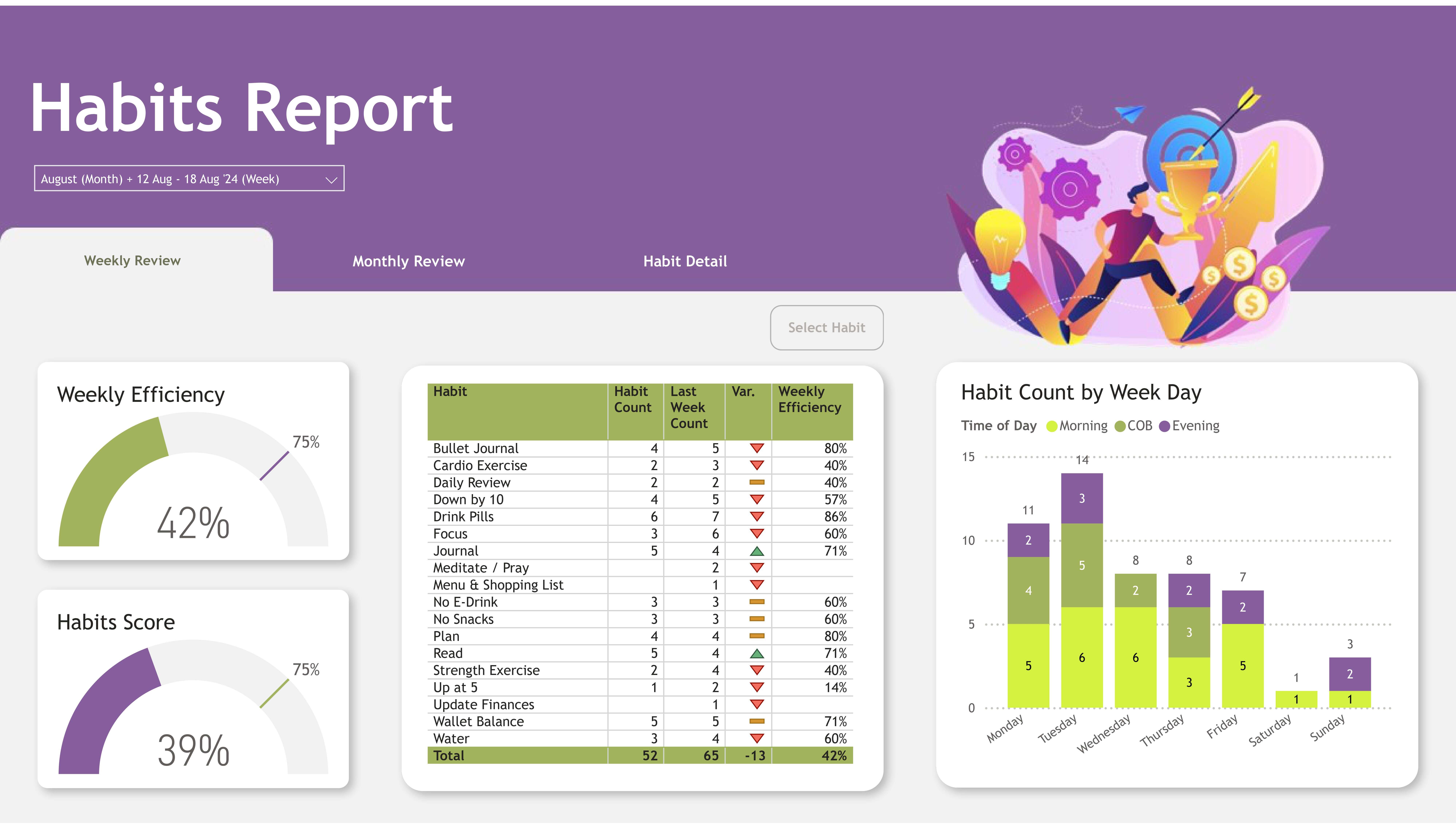
Weekly Review: A Snapshot of Progress

This is the landing page of the report. It gives you a quick snapshot of your overall progress, as well as how you are doing on a weekly basis. It features a bar chart showing how many times I completed each habit daily, plus a weekly efficiency gauge to see how close I am to my targets. My habit score, which tracks my progress over time, is also highlighted.
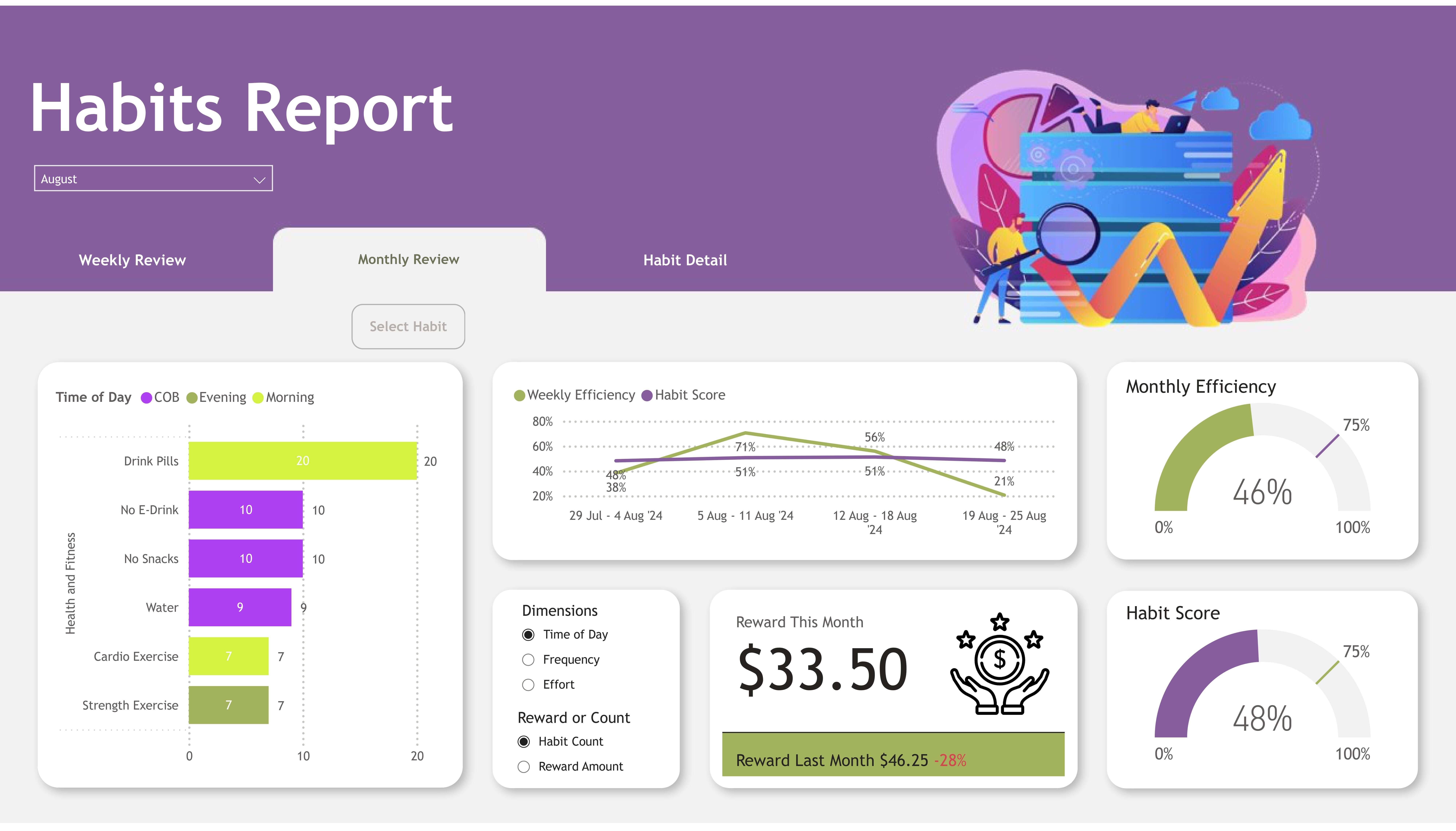
Monthly Review: Categorizing and Analyzing Habits

The second page focuses on the monthly review, where habits are grouped into categories. A dynamic bar chart with field parameters lets me explore habits by different dimensions, such as time of day, effort level, and frequency. Similar to the weekly review page, it has an efficiency score and an overall score. There is a reward value which helps to keep you motivated.
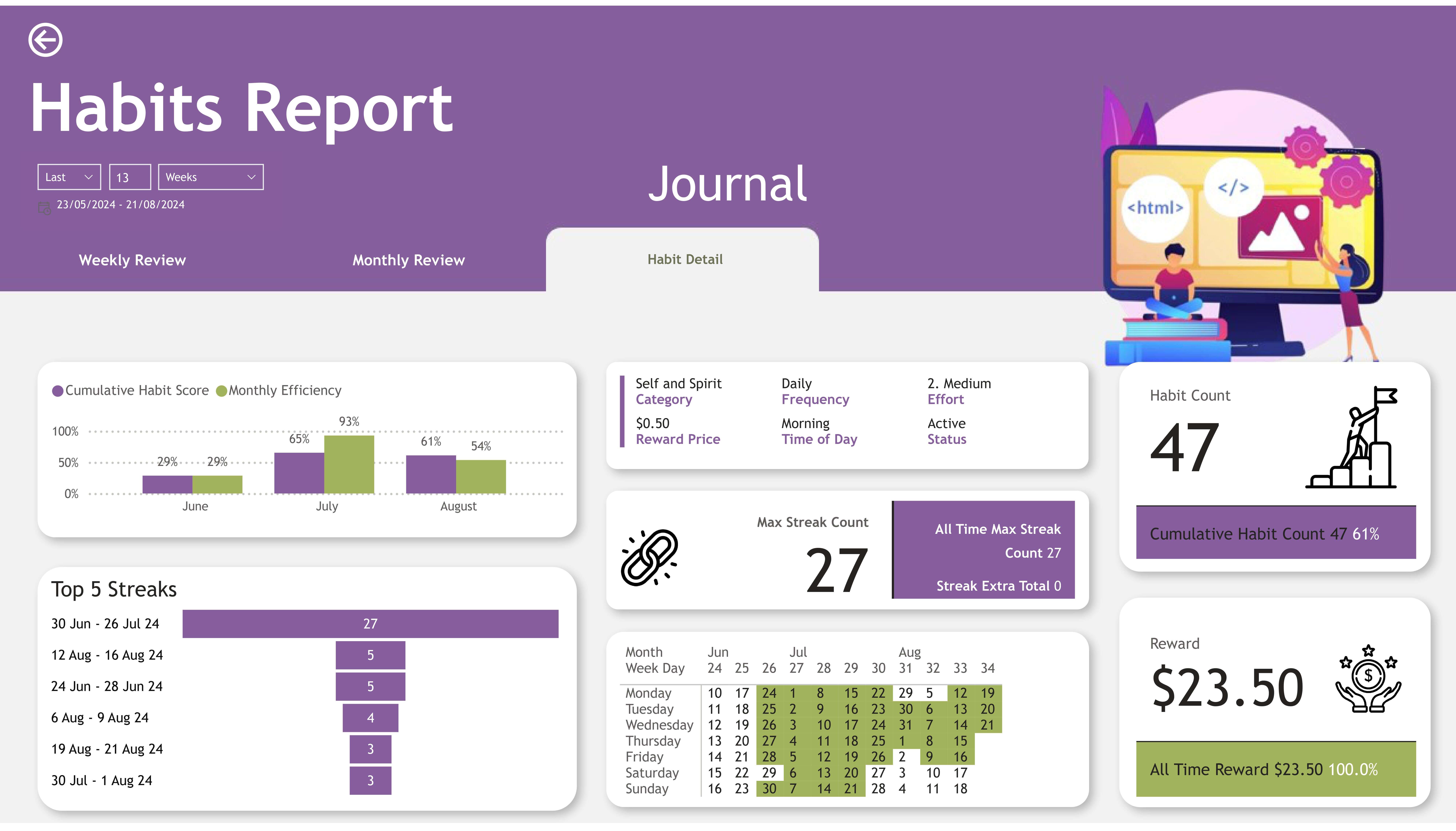
Habit Detail: Digging Deeper

For data enthusiasts like me, this page offers a deep dive into each habit. The habit detail page is accessible through drill-throughs from the weekly or monthly review. This page offers a more detailed view, including streaks—both current and all-time best—and a calendar to visualize habit completion.
This page is a personal favorite. It calculates the monetary value assigned to each habit and tallies up my rewards. This is how I keep myself motivated—I know that every completed habit gets me closer to guilt-free spending on gadgets or other fun stuff! 🛒
Building the Report 🏗️
To keep the design cohesive, I turned to freepik.com for illustrations that matched my vibe and used Adobe Colors to generate a custom color palette. I applied this palette to Power BI themes so the report had a consistent look throughout. I also used flaticon.com for icons, which added a polished touch to the visuals.
For me, weekly and monthly reviews are key. Each week, I check off tasks I’ve completed and review my habits to ensure I’m staying on track. At the end of the month, I go one step further—I tally up the completed habits, assign a monetary reward to each (based on difficulty and frequency), and transfer the total to a separate “fun” savings account. This way, I can guiltlessly splurge on gadgets or other treats I love. 🛍️
How I Use It 👨💻
I embed the Power BI habit report directly into my Notion workspace, making it super easy to access during my weekly and monthly reviews. The only manual step left is running the Python script every week to generate the streaks data. (I’m working on automating this and might use Supabase for storing the data. Supabase offers 500MB of free database storage, which sounds perfect for this use case.)
To make it easy for you to explore, I’ve created an example version of the report using dummy data. Unlike my actual report, which connects to my Notion database via the API, the example report connects to CSV files so you can test it out yourself. If you’re curious about setting up something similar, check out my GitHub repo for step-by-step instructions on using the Notion API with Power BI.
Download the Report 🔗
You can download the PBIX file here and explore it on your PC. Feel free to click through the embedded example report below to get a feel for how it works. Once I’ve automated the streaks process, I’ll update this post with all the details.
