Managing personal finances can be overwhelming, but with the right tools, it becomes a breeze! 🚀 I recently built a Personal Finance Dashboard in Power BI to track my spending, net worth, and whether my wife and I are sticking to a structured budget. Here’s a breakdown of how I designed it, the challenges I faced, and the lessons I learned along the way. Getting Inspired 🎨
Before jumping into Power BI, I needed a design that looked clean and intuitive. One of my go-to YouTube channels, GuyInACube, featured Mara Pereira sharing some dashboard design tricks (watch it here). She mentioned using Dribbble for design inspiration, so I took a look and found a sleek finance management dashboard (check it out).
To match the aesthetics, I used Adobe Color (link) to extract a color palette from my chosen design. Normally, I’d create my layouts in PowerPoint and save them as background images (like I did for my Habits Report), but this time, I wanted all elements directly in Power BI. This was crucial since Power BI doesn’t allow separate visualizations for mobile reports—it only reuses visuals from the main page.
The Challenges
1️⃣ Designing for Mobile 📱
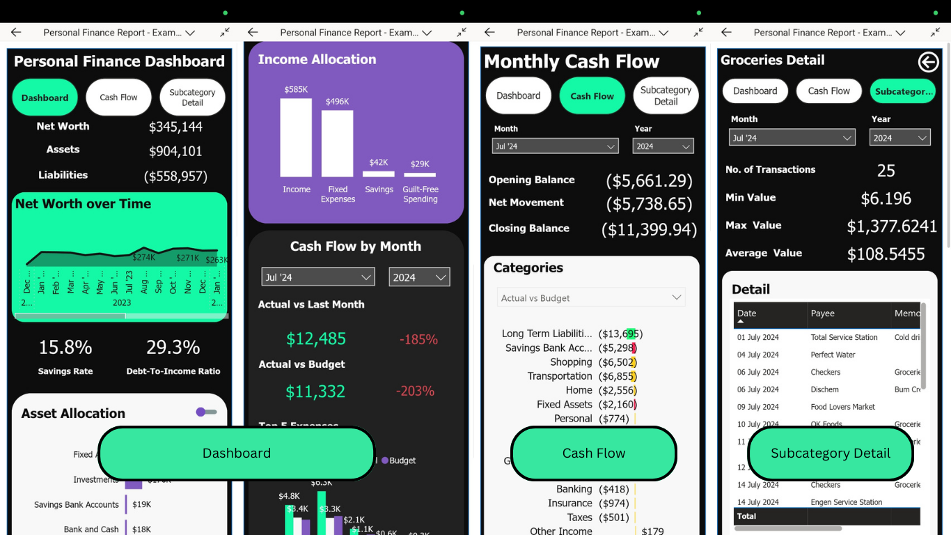
One of the biggest challenges was designing a mobile-friendly dashboard. Power BI only allows you to reuse visuals from the main report for the mobile layout—you can’t create separate mobile-only visuals. This meant I had to carefully arrange my visuals so they would work on both desktop and mobile without feeling cluttered.
2️⃣ Avoiding Tables, Embracing Charts 📊
A key challenge was designing a table-free dashboard. Power BI makes it easy to slap down tables, but I wanted charts and graphs to tell the story visually. This forced me to be more thoughtful about which visuals to use and how to structure them.
3️⃣ Handling Negative & Positive Values 🔄
Finance data often includes both debits and credits, meaning some numbers are positive while others are negative. On a chart, this looked messy. My fix? Convert both debits and credits into positive numbers while keeping the meaning intact—cash inflows and outflows were visually distinct but not confusing.
4️⃣ Dealing with Outliers 📉
Some transactions (like a car purchase) could be way higher than typical monthly spending. These outliers could skew the entire visual. Since my dashboard included drill-through pages (clicking on a chart element to see details), I had to ensure: ✔️ Larger visuals for key categories ✔️ Filtering for Top 5 items to avoid clutter
Structuring My Budget Based on Ramit Sethi’s Approach
I’m a big fan of Ramit Sethi and his “Live Your Rich Life” concept (his YouTube channel). He suggests breaking expenses into:
Fixed Expenses 🏠 (rent, utilities, insurance)
Savings & Investments 📈 (retirement, emergency fund)
Guilt-Free Spending 🍽️ (dining out, entertainment)
Each category has an ideal percentage of income allocation, and I wanted to track whether we were sticking to that. I built a custom visual that compares our spending against Ramit’s recommended budget percentages. This helps us stay on track and avoid lifestyle inflation!
Connecting the Data: GnuCash as the Source
For bookkeeping, I use GnuCash (open-source and awesome) because: ✔️ It’s free and customizable ✔️ I can import bank transactions (OFX files) ✔️ I even built a small tool to auto-update recurring transactions (GitHub repo)
My dashboard pulls most data directly from GnuCash, with additional tables from Excel (for Ramit Sethi’s budget categories) and custom tables for calendar events & budget goals.
Try It Yourself!
You can interact with the embedded Power BI report below and explore how it works! (If you’re on mobile, viewing it on a larger screen will give a better experience.)
📥 Want to dive deeper? You can also download the PBIX file to check out the data model and formulas. (Note: The data is mock data, not my actual finances!)
Since Power BI doesn’t allow mobile reports in embedded views, I’ve also included screenshots of the mobile version so you can see how it looks on smaller screens.

Building this was a fun challenge, and it really helps me keep my finances in check. Let me know what you think or if you have any tips for improving it! 🚀
