When it comes to data analysis, there’s something incredibly satisfying about taking raw data and transforming it into meaningful insights. Recently, I worked on an Excel project that reminded me why I enjoy data analysis—it was a great opportunity to explore the power of PowerQuery and the Data Model.The journey started with a dataset from Kaggle—a well-structured but sizable file that initially brought Excel to a crawl. That’s when I realized: instead of fighting with performance issues, I could leverage PowerQuery to streamline the ETL (Extract, Transform, Load) process and build a dashboard that was both functional and efficient. Let me walk you through how I did it and why PowerQuery has become an indispensable tool in my data analysis toolkit.
The Project: From Dataset to Dashboard
Finding the Right Dataset
I began my adventure on Kaggle, searching for an “online retail sales” dataset. But here’s the thing: I wasn’t looking for a clean, ready-to-use dataset. Instead, I wanted something a little rough around the edges—because let’s face it, real-world data is rarely perfect. I specifically looked for datasets with a usability score below 8, as these often come with the kind of challenges that make for great learning opportunities.
After some digging, I found a dataset that could fit the bill. It was large (22MB—yikes!) and had a few quirks to keep me on my toes. You can check out the dataset I used here if you’re curious.
Exploring and Cleaning the Data
The first step was downloading the dataset. It was in a CSV format. The only challenge so far was that the file was large. I opted to rather use PowerQuery at this point because copying and pasting all the data into a worksheet would slow down Excel. Also, instead of loading the data directly into a table, I kept it in the Data Model—a decision that saved me a lot of headaches later on.
Before diving into cleaning, I used PivotTables to explore the data and get a feel for what I was working with. I checked things like:
- Did each transaction have only one unique date, customer, and country?
- Did each product name correspond to only one distinct product code?
This initial exploration revealed some interesting issues:
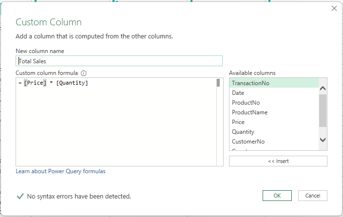
- There was no “total price” column, which meant I’d need to calculate it myself.
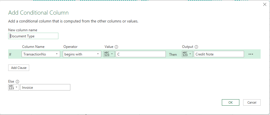
- Some transactions had negative quantities. After reading the dataset description on Kaggle, I learned that transaction numbers ending with a ‘C’ represented returns or credit notes. Mystery solved!
Why PowerQuery is a Game-Changer
One of the most intriguing discoveries was a product that appeared in the top 10 by total sales but had a total quantity sold of zero. How was that possible? Turns out, the sales price was double the return price, and both transactions happened on the same day. It was a strange pattern that reminded me just how important it is to validate your data and dig deeper when something doesn’t add up.
PowerQuery truly shines when it comes to automating repetitive tasks and making data cleaning a breeze. Here’s how I used it to tackle the challenges in this dataset:
- Creating a Total Price Column: I added a calculated column to multiply quantity by price, saving me from manually calculating it for every row.

- Classifying Transactions: Using PowerQuery’s conditional columns feature, I created a “Document Type” column to label transactions as “Credit Note” or “Invoice” based on the transaction number.

- Building a Calendar Table: For time-based analysis, I created a calendar table in Excel and used PowerQuery to enrich it with columns like “Year-Month Name” and “Year-Month Sort” for better organization.
These steps not only saved me hours of manual work but also ensured that the data was consistent and ready for analysis.
Building the Data Model and Dashboard
With the data cleaned and prepped, I added a few more tables to enrich the analysis:
- Calendar Table: Linked to the transactions table for seamless time-based analysis.
- Countries Table: Created with a little help from ChatGPT to categorize countries by continent.
After linking these tables in the data model, I marked the calendar table as the primary date table. This small but crucial step made time-based analysis a whole lot smoother and set the stage for building the dashboard.

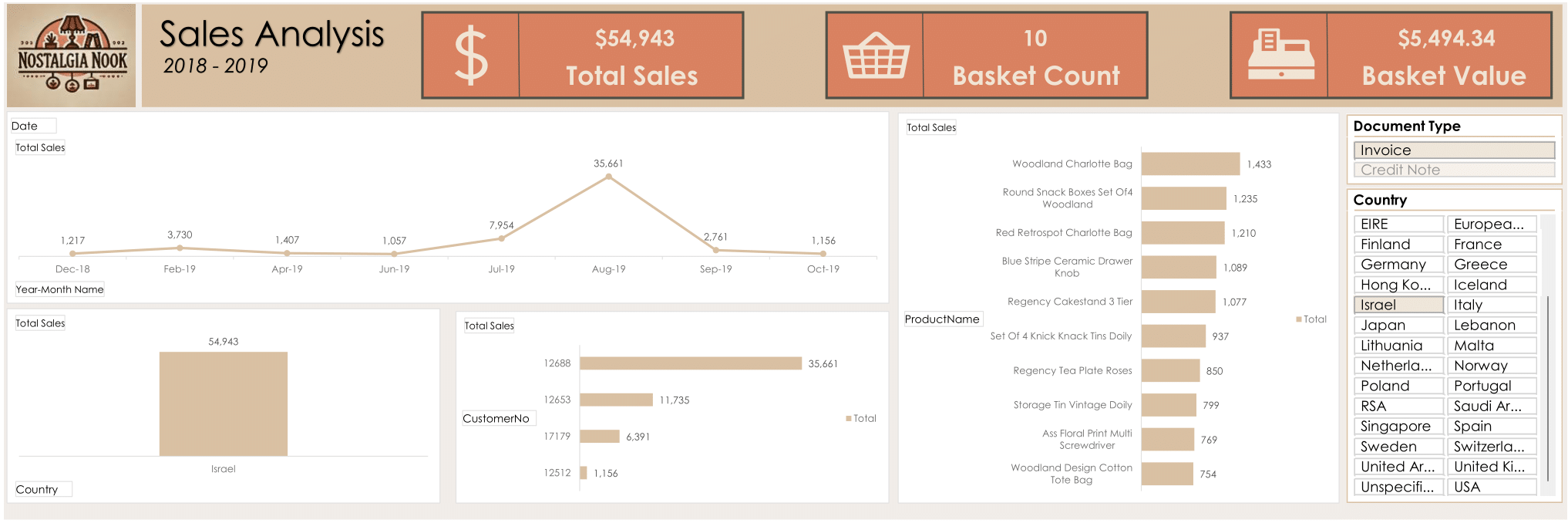
Once the data model was ready, I created several Power Pivot Tables to visualize key metrics. These tables became the foundation for charts that focused on dimensions like:
- Customer
- Country
- Product
- Date
To make the dashboard interactive, I added slicers for each dimension. This allowed users to drill down into specific insights—like viewing sales by country or filtering by date range—and see the charts update dynamically. It was like giving the data a voice, letting it tell its own story.
Adding a Touch of Branding
No dashboard is complete without a little flair. Using CoPilot, I brainstormed a name and logo for a fictitious online business. Then, I used Adobe Colors to extract a cohesive color palette from the logo and applied it to the charts. The result? A dashboard that wasn’t just functional but also visually appealing. After all, if you’re going to present insights, why not make them look good too?
My Final thoughts
PowerQuery is an Excel a Game-Changer
This project reminded me why PowerQuery is such a powerful tool for data analysts. Here’s what makes it indispensable:
- Time Savings: Automating repetitive tasks like column transformations and table linking speeds up the ETL process.
- Data Validation: Features like PivotTables and conditional columns make it easy to spot and fix anomalies.
- Scalability: By keeping large datasets in the Data Model, PowerQuery lets you work efficiently without sacrificing performance.
If you’re not already using PowerQuery, you’re missing out on a tool that can transform the way you work with data.
Expect the Unexpected
One of the biggest lessons from this project was that what you set out to achieve at the beginning might not be what you end up with—and that’s okay. I started with the goal of creating a dashboard that would highlight sales trends across continents, so I added a countries table to group the data by region. But when the data revealed that over 90% of sales came from Europe, the visualizations for other continents became almost invisible. While this might not have been the most visually appealing outcome, it’s still valuable: it could help a sales manager focus their marketing efforts squarely on Europe. Sometimes, the data tells a story you didn’t expect, and that’s part of what makes analysis so interesting.
This project also reminded me how much I enjoy using PowerQuery as a tool. I typically use it in Power BI, so it was a nice surprise to revisit its capabilities in Excel. It’s easy to forget how powerful Excel can be when you pair it with tools like PowerQuery and the Data Model. Whether you’re cleaning data, building relationships between tables, or creating interactive dashboards, PowerQuery makes the process smoother and more efficient.
If you haven’t tried PowerQuery in Excel yet, I highly recommend giving it a go. It might just become your new favorite tool for tackling data challenges—big or small.
Ready to level up your data game? Give PowerQuery a try and see how it can transform your workflow. Trust me, your future self will thank you! Download my dashboard here.
